TIME Homepage Redesign
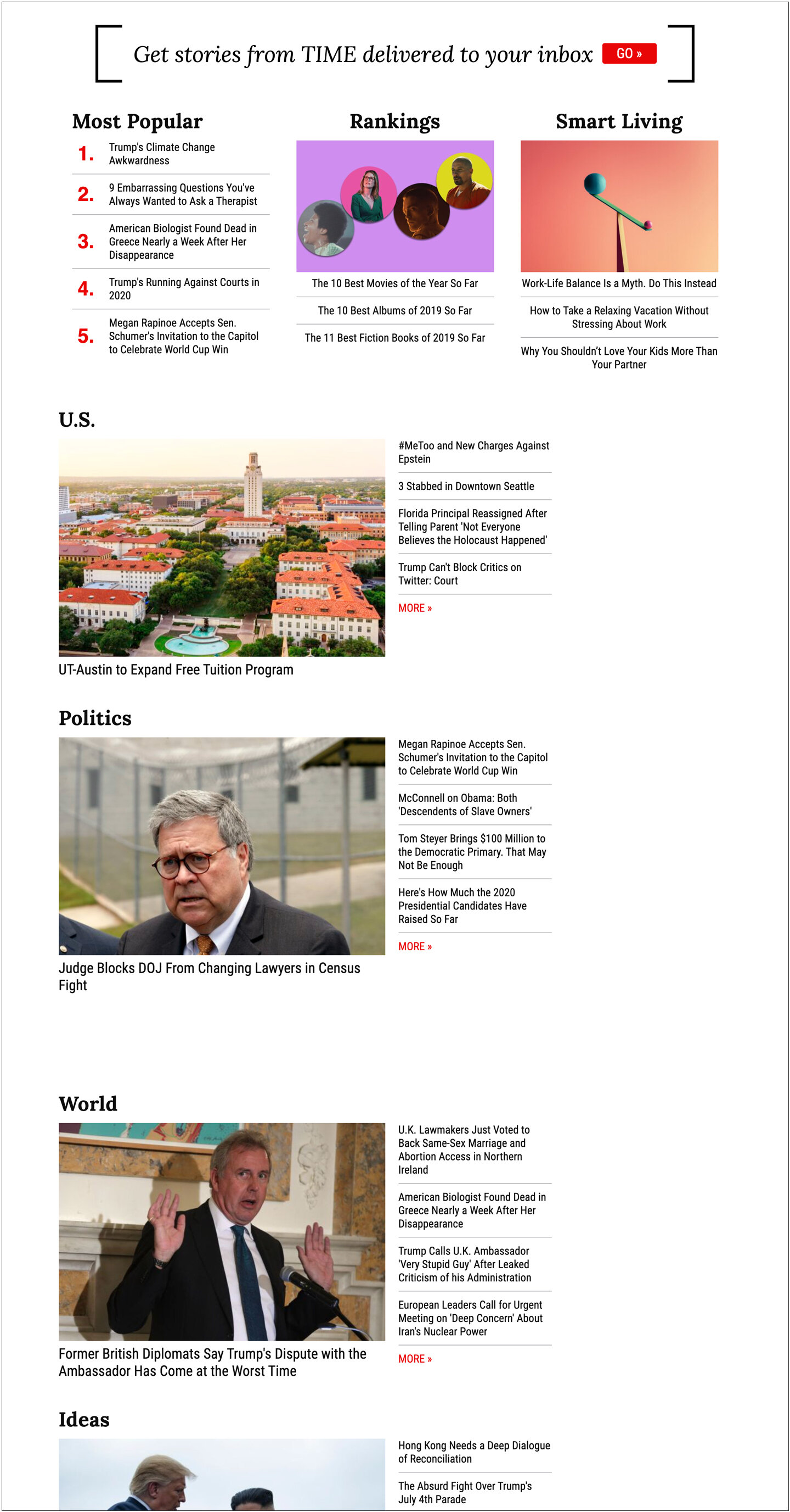
In April 2020, we relaunched the TIME homepage with an updated structure, visual design, and a true emphasis on mobile usability. The circumstances were unique: we were in the middle of a period where news traffic was soaring, but most content produced was under just a few narrow subjects -- the pandemic, the election, and human rights. Our previous homepage felt constricted within a structure that no longer fit the way news was consumed. As the UX/UI design lead, I conducted internal stakeholder interviews and reviewed editorial content plans to create the new designs,. Within the first 100 days after launch, time spent on the page increased by over 1 full minute for the average reader.
ROLE: UX + UI Design Lead
Stakeholder INterviews
Wireframes
Visual Design
QA
In Collaboration With:
Product, Engineering, Editorial
The Problem
The previous homepage was no longer a good fit for the type of content TIME was producing. As the structure of the page became less useful, the page became increasingly stagnant and uncompelling. The specific issues we identified were:
Multiple vague section labels on the top half of the page (e.g. The Brief, Featured) made the page feel like it lacked direction.
Broad category labels on the bottom half of the page (e.g. Politics, U.S.) gave rarely-updated categories the same importance as frequently-updated ones.
The page lacked space to showcase premier, photo-driven features.
The best stories from each news cycle were buried under the “Magazine” section and only represented by a small cover image.
The page only reflected the news content that TIME produced, and did not provide space to showcase any brand extensions.
The page also did not function well on mobile.
The elements felt clunky and awkward, and not intended for a mobile screen. Also, captions and buttons covered most of the lead photography.
Research
In order to identify needs and usability gaps, I conducted interviews with internal stakeholders including the editorial staff, the news desk, the photography team, marketing, and ad sales. We also established and reviewed content audits, to better track which types of stories were being produced, and how frequently. We uncovered the following key findings:
Solutions
After many rounds of wireframes and peer review, we launched a design with the following improvements:
Fully mobile-first UX: Prioritized mobile functionality and swiping behaviors to allow for deeper dives into content with less scroll fatigue.
Useful, timely category sections: Content organized by relevant microtopics that can be easily swapped out.
Elevated brand discovery: Provided dynamic space to showcase brand extensions and growing franchises.
Dedicated space for content with long-term relevancy: Dashboards, trackers, and references with long-term usefulness were grouped together into a high-visibility reference section (You Should Know).
Shifted focus away from news feeds: Larger image spaces and a Featured Voices section moved the page focus to the photography and access to experts for which TIME is renowned.
Modular build: Allowed us to iteratively introduce and test features, and add or remove blocks based on the news of the day.
Ad-free experience: This was a deliberate choice to use the homepage as a way to drive engagement.
Directly interactive marketing units: Allowed users to sign up for newsletters directly on the page.
The Response
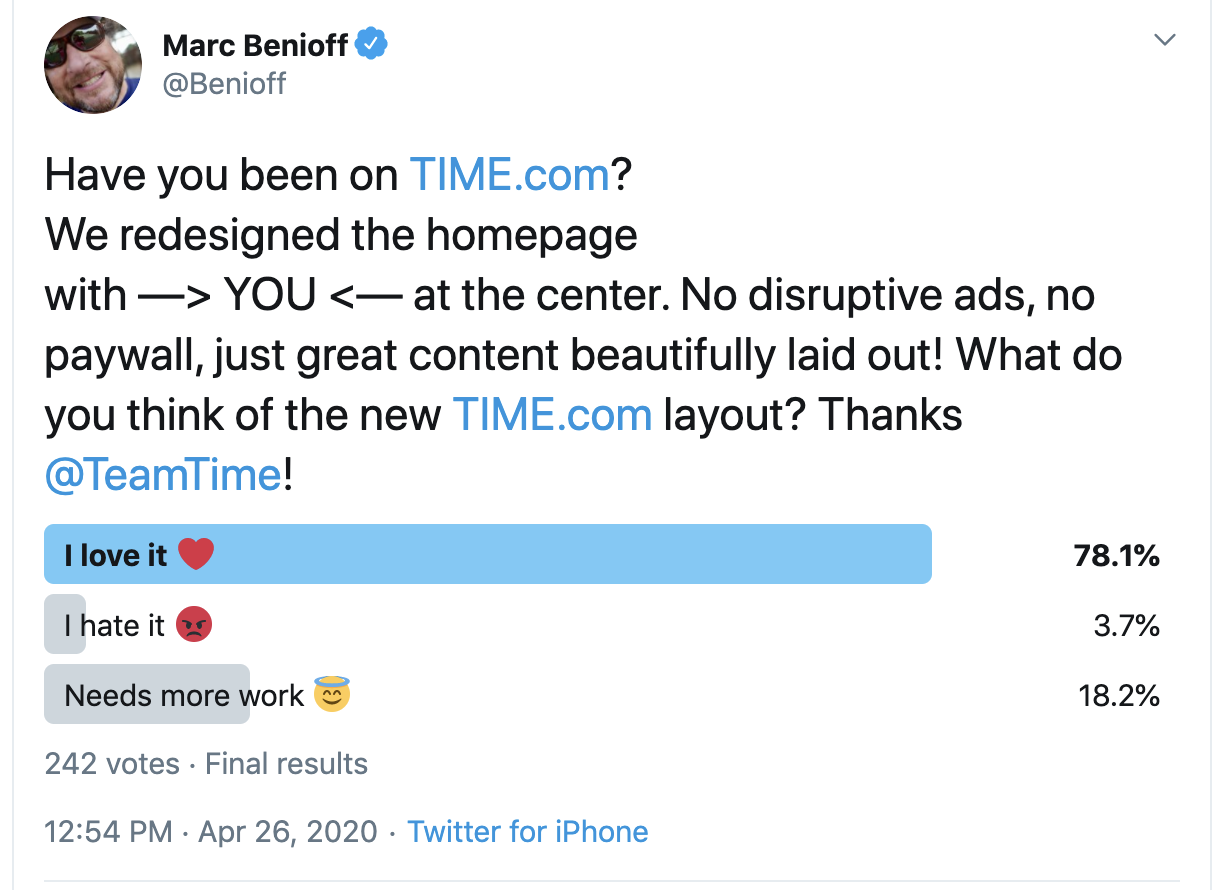
Response to the new homepage was positive overall. A social poll showed satisfaction with the new design at over 78%. In the 100 days following launch, time spent on the page increased by 47%, or an average of over full 1 minute per user. Percentage of loyal users increased by over 8%.


